I’ve always been drawn to crystals—not just visually, but for the quiet presence and meaning they carry.
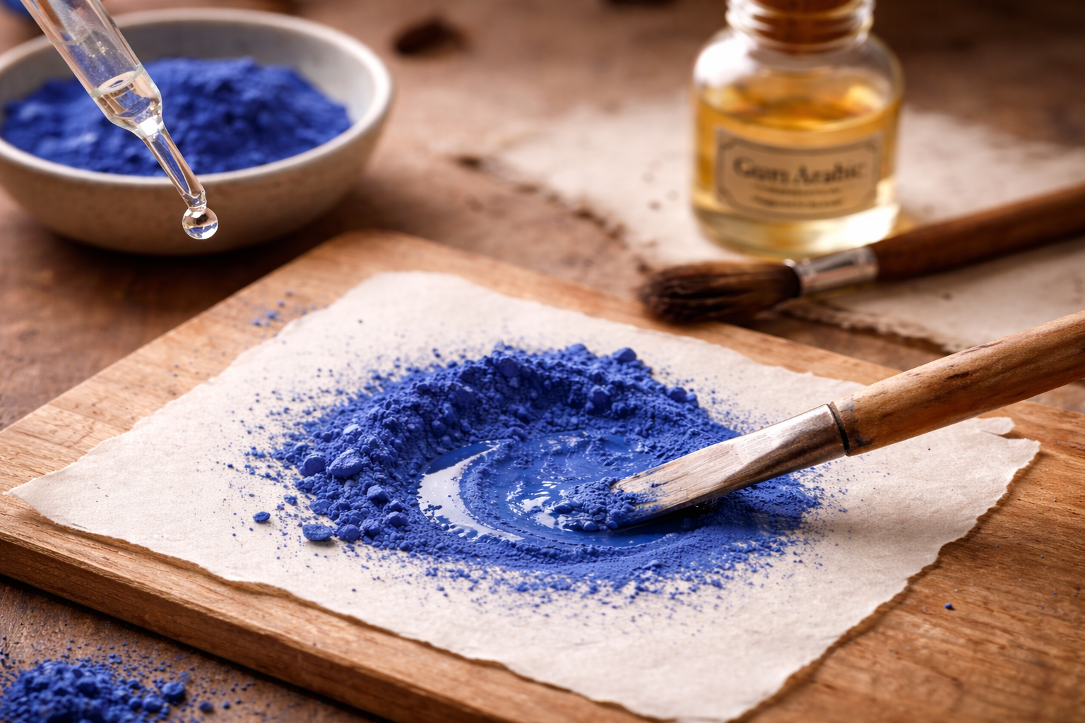
When I started working with natural pigments, I realized that some watercolor paints are actually made from real mineral and crystal sources.
That changed the way I see the process.
It no longer feels like working with colour alone, but with the material itself—something that already holds its own structure, history, and, for some, energetic qualities.
Painting as an Extension of Energy
I don’t approach this in a rigid or overly defined way.
But when the material comes from a real mineral or crystal, something shifts.
The colour feels less flat, less controlled—and more alive.
It becomes less about perfect technique and more about allowing something to come through.
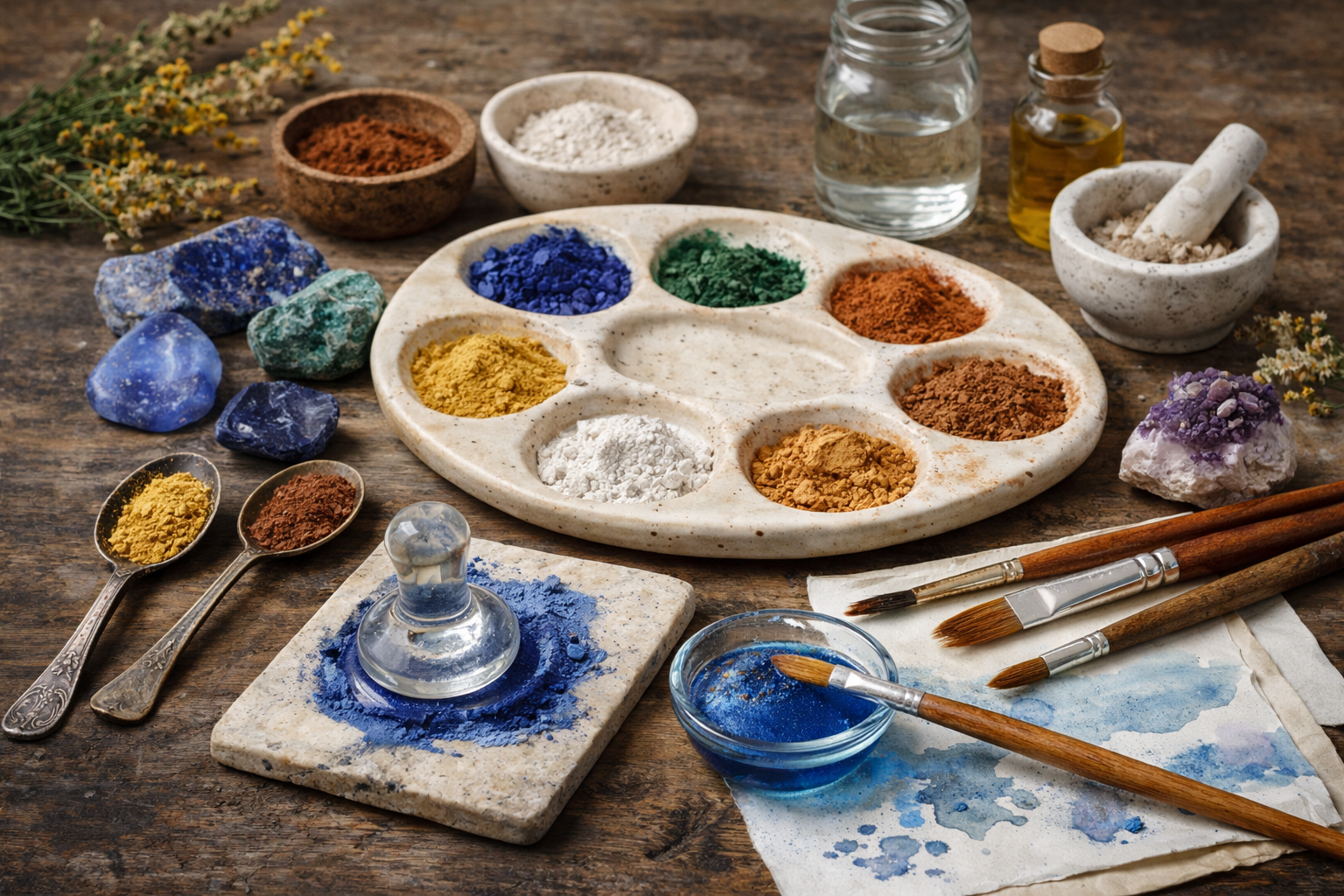
Genuine Crystal Pigments
Some watercolor pigments are derived from real mineral sources.
Brands like Daniel Smith offer pigments made from stones such as:
- rhodonite
- tiger eye
- sodalite
- zoisite
- blue apatite
- black tourmaline
- amazonite
- kyanite
- hematite violet
- amethyst
I’ve also seen lapis and azurite in the past, although they can be harder to find.
Crystal Pigments & Their Meaning
I don’t treat these associations as something rigid or prescriptive.
But I do find it interesting how each material carries its own traditional meaning—and how that can subtly influence the creative process.
Rhodonite
Often associated with emotional balance, compassion, and healing.
It is connected to the heart space and is sometimes used to support releasing emotional tension and bringing a sense of calm.
As a pigment, it translates into soft, muted tones that feel gentle and stabilizing, often working well in more subtle or quiet compositions.
You can find genuine rhodonite watercolor here:
Tiger Eye
Traditionally linked to protection, confidence, and prosperity.
It is often associated with grounding energy while also supporting clarity in decision-making and personal strength.
In pigment form, it brings warm, earthy tones that feel structured and steady, adding a sense of strength and direction to a painting.
You can find genuine tiger eye watercolor here:
Sodalite
Associated with clarity, truth, and communication.
It is often connected to deeper thinking, expression, and the ability to see things more clearly.
Its deep blue tone naturally reflects a more introspective quality, making it useful in areas of contrast, shadow, and depth.
You can find genuine sodalite watercolor here:
Zoisite
Linked to transformation and personal growth.
It is often associated with moving through change while maintaining balance and connection to oneself.
As a pigment, it introduces variation and complexity, adding a sense of movement and evolution within a composition.
You can find genuine zoisite watercolor here:
Blue Apatite
Often connected to inspiration, motivation, and creative expression.
It is associated with clarity of thought and a more energized state of mind.
Its brighter blue brings a more vivid, expressive quality, helping a piece feel more open and dynamic.
You can find genuine blue apatite watercolor here:
Black Tourmaline
Widely known for protection and grounding.
It is often used as a stabilizing presence, helping to anchor energy and create a sense of safety.
In painting, its deep, dark tones provide strong contrast and structure, grounding the overall composition.
You can find genuine black turmaline watercolor here:
Amazonite
Associated with calm, balance, and emotional clarity.
It is often linked to soothing energy and openness, helping to create a sense of ease.
Its soft blue-green tones bring lightness and space into a piece, making it feel more relaxed and fluid.
You can find genuine amazonite watercolor here:
Kyanite
Often connected to alignment, communication, and energetic balance.
It is sometimes associated with clear expression and flow, without force or resistance.
Its layered blues work beautifully in atmospheric painting, creating a sense of depth and movement.
You can find genuine kyanite watercolor here:
Hematite Violet
Linked to grounding, stability, and subtle energetic balance.
Hematite is often associated with anchoring energy and bringing things back into alignment.
This pigment creates muted violet tones with a slightly earthy quality, offering a more natural alternative to brighter purples.
You can find genuine hematite violet watercolor here:
Amethyst
Associated with intuition, clarity, and inner awareness.
It is often connected to the third eye, calmness, and a more inward state of reflection.
As a pigment, it produces soft violet tones that feel refined, quiet, and more subtle than synthetic purples.
You can find genuine amethyst watercolor here:
Daniel Smith Extra Fine Watercolor, Amethyst Genuine
Lapis / Azurite
Traditionally associated with wisdom, perception, and deeper insight.
These pigments have a long history in art and are often linked to higher awareness and creative expression.
Their rich blues carry a strong presence and depth, making them visually and symbolically powerful.
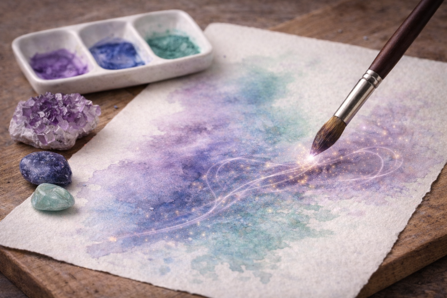
Energy Within the Work
One of the things I find most interesting about working with crystal-based pigments is that the material itself becomes part of the artwork—not just visually, but in a more subtle way.
When a painting is created using pigments derived from specific minerals, it’s not only about the colour that appears on the surface.
There’s also the origin of the material—the stone itself, with its structure, history, and the qualities it has traditionally been associated with.
In that sense, the finished piece can feel like it carries a quiet imprint of those qualities.
Not in an obvious or literal way, but more as an underlying presence.
It becomes more than just an image—it can feel like a subtle extension of the energy behind the material itself.
A Different Way of Working
For me, this isn’t about proving anything.
It’s more about awareness.
Sometimes I simply paint.
Other times, I’m more conscious of the material—what it is, where it comes from, and what it has been associated with over time.
That awareness alone changes the experience.
Final Thoughts
Working with crystal-based pigments adds a different layer to the process.
Even if it’s subtle.
Even if it’s just an idea in the background.
It brings the material closer to its origin—and that alone can shift how the work feels.
Related from my Art Garden
FAQ
Are these pigments really made from crystals?
Some are derived from natural mineral sources, while others are inspired by them and processed into stable pigments.
Do crystal pigments carry energy or meaning?
Traditionally, many crystals are associated with certain qualities. Whether you connect with that aspect or not is entirely personal.
Do they behave differently from regular watercolors?
Slightly. They can feel more textured, less uniform, and more naturally varied.
Can beginners use these pigments?
Yes. They can be used like regular watercolors, although they may take some getting used to.
Is this more about art or spirituality?
It can be either—or both—depending on how you choose to approach the materials.
Disclaimer
This post is based on personal experience and traditional associations of crystals.
It is intended for those who are open to or curious about the energetic or symbolic aspects of materials, as well as for those who simply appreciate unique, mineral-based pigments from an artistic perspective.
It is not intended as medical, psychological, or spiritual advice.